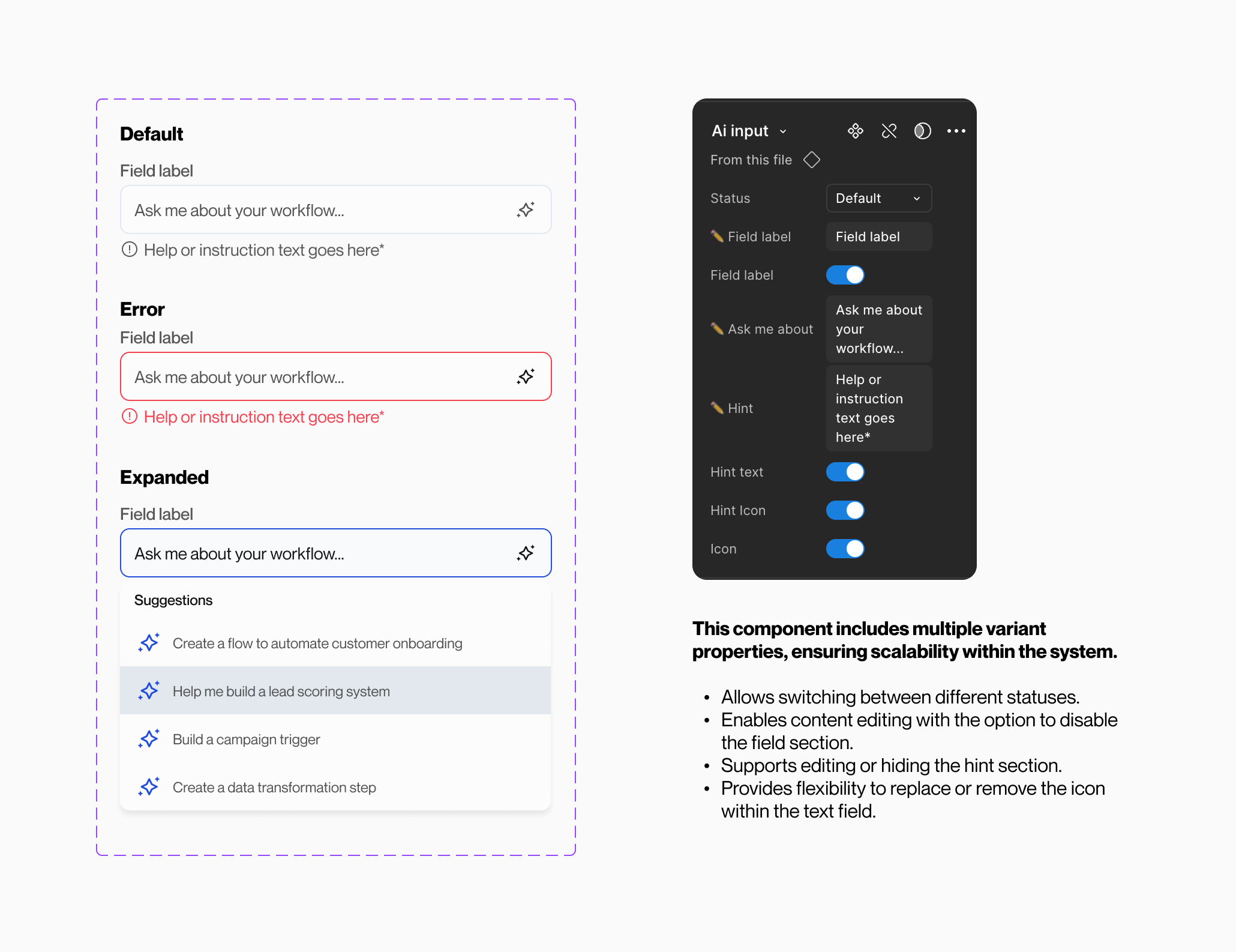
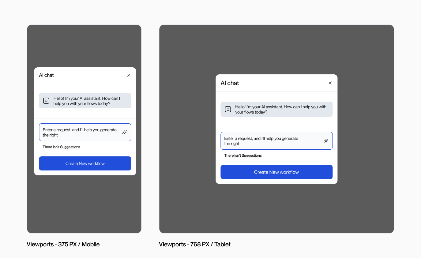
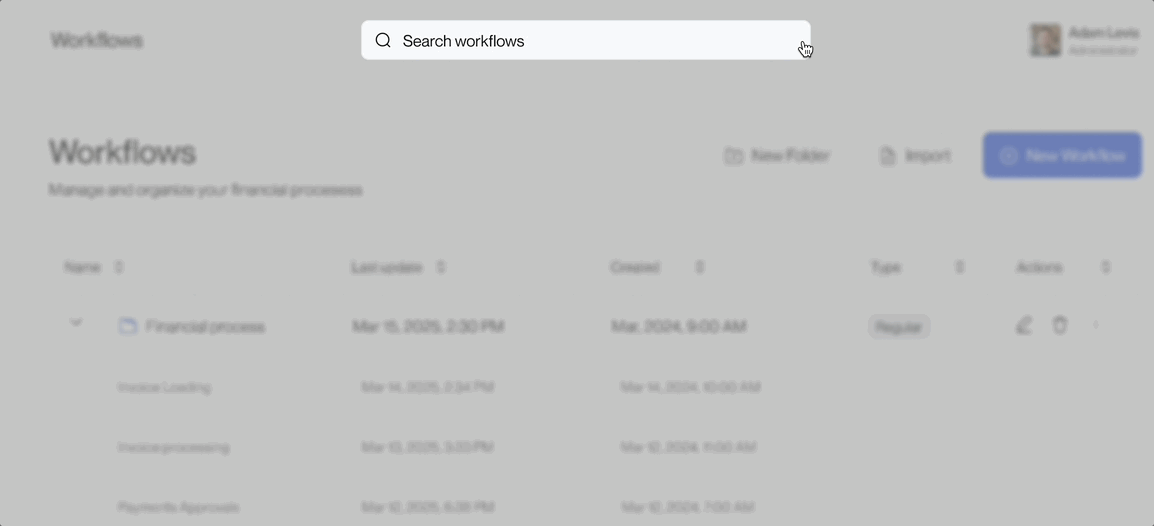
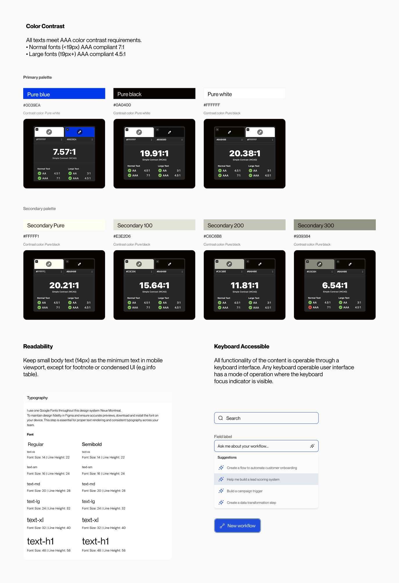
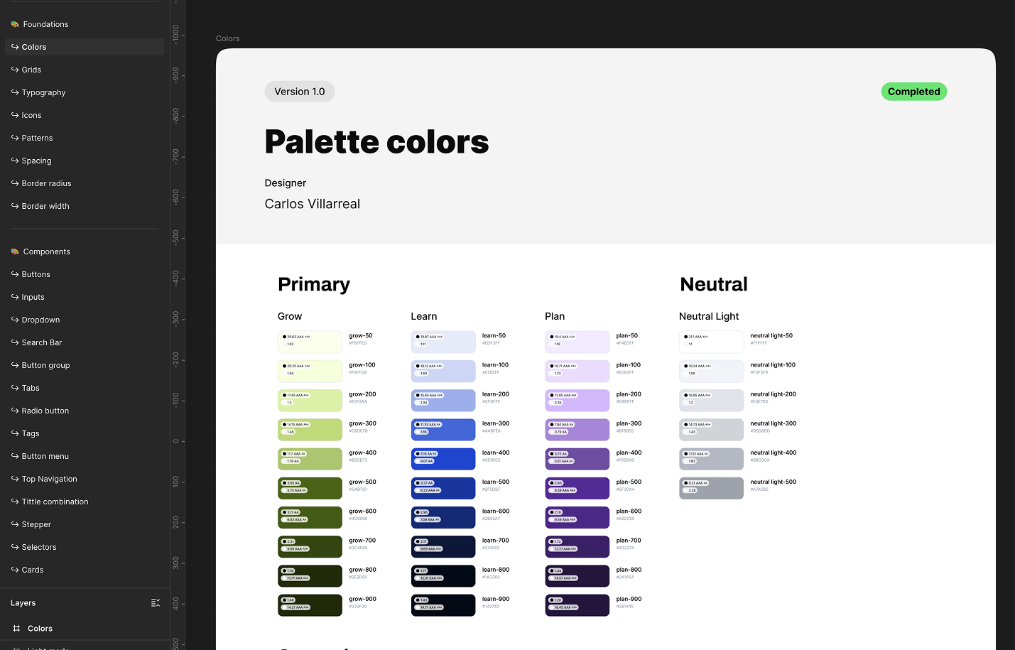
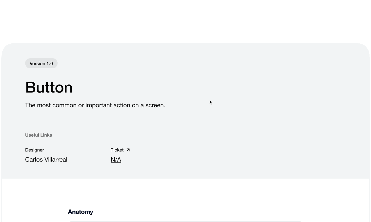
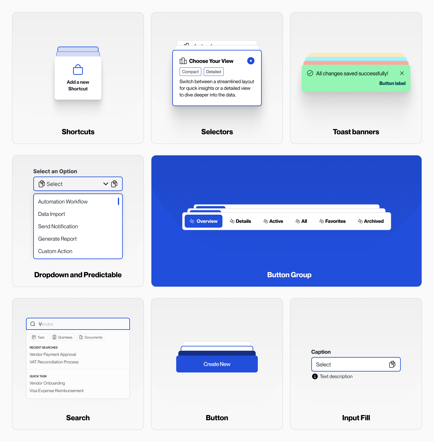
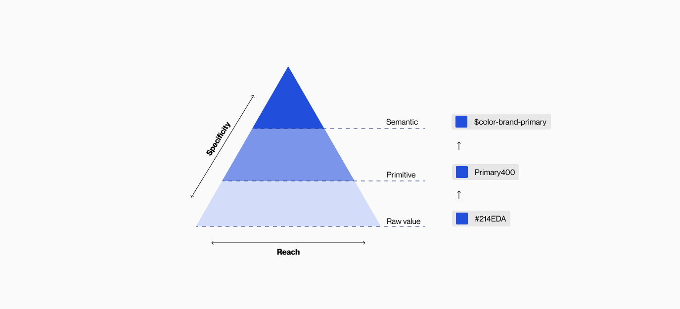
PROJECT NAME

Design System for Workflow and AI Low-Code Platform.

ABOUT THE PRODUCT

Create a component library that ensures consistency, enables scalability, supports accessibility, fosters collaboration, and easy to maintain.

Challengues

- There was confusion among designers as multiple libraries were available simultaneously, making it difficult to determine which components were correct to use.
- Designers resorted to building components in separate local design files due to uncertainty regarding their reusability across different projects.
- There was a misalignment between design and production, as clear guidelines were lacking for various states, behaviors, interactions, and use cases.
- The existing design system was not sufficiently organized, making it challenging to easily search for specific components.

ROLE

UX/UI Designer

Design and validate

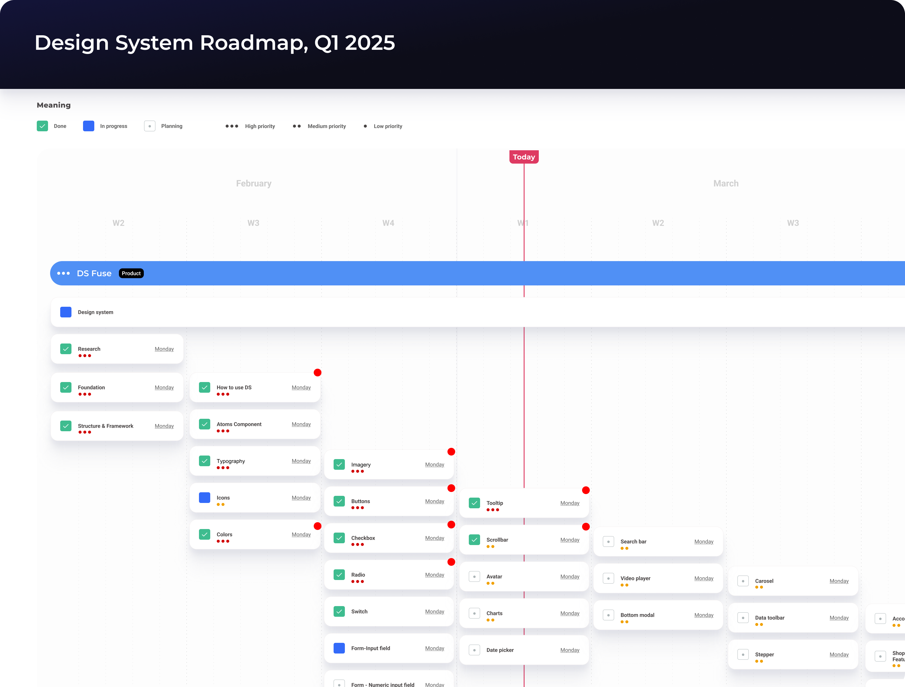
Prior to commencing the design phase, I formulated a concise plan and established an estimated timeline. This served to assist senior management in visualizing the prioritization of resources and setting expectations regarding the subsequent steps and the anticipated final outcome within a specific timeframe.

Configurable

Designers can now effortlessly and intuitively configure components within Figma. For instance, when working with an accordion, designers can readily access the desired variations through the variant panel. With the optimization brought about by Config 2022, which includes the ability to set boolean and text properties, designers can conveniently configure all component variations from a centralized location.

Scalable

Thanks to a meticulously established auto-layout system, all components within the design system are now seamlessly scalable across various viewports. From mobile (375px) to tablet (768px), desktop (1024px), and even ultra-wide screens (1440+px), designers can effortlessly utilize the components to create UIs of any desired screen size.

Interactive

Presenting the design to various stakeholders holds significant importance for designers. Utilizing a more realistic prototype can greatly enhance their ability to visualize and comprehend the concepts and ideas, particularly when accompanied by detailed micro-interactions.

Accessible

Ensuring accessibility is a paramount consideration during the development of DS. We adhere to the WCAG2 (Web Content Accessibility Guidelines) when designing the components, guaranteeing that they meet the necessary accessibility requirements prior to release. By doing so, we promote inclusivity and cater to the needs of diverse user groups. To achieve this, we conduct rigorous checks on color contrast, screen reader compatibility, keyboard accessibility, focus visibility, and readability before each release.

Design System Structure

We have meticulously structured the content within our Figma master library, starting with a comprehensive guideline on system usage and the methodology employed to organize the system. Following the principles of atomic design, our library begins with atom-level components, followed by molecules, organisms, and so on. The final section encompasses additional supporting information, such as planning and timeline documentation, a UX wireframe kit, and component page framework controls. This organization ensures clarity and efficiency when navigating the library's content.

Documentation

Is important to have this documentation with developers ensures that design components are implemented accurately and consistently. It provides clear guidance on structure, behavior, variants, and interaction patterns, reducing guesswork and development time. With proper documentation, developers can build with confidence, maintain design integrity, and scale the system efficiently—leading to a more unified and high-quality user experience.

Components

Builds consistency, efficiency, and scalability into the product development process. Reusable components ensure that interfaces look and behave consistently across different screens and user flows, which strengthens the brand and improves usability.

Design Token

In order to establish a scalable and consistent visual system for UI development, as well as manage visual design attributes in a systematic manner, I collaborated with a designer from the Design Ops team to devise a design token structure for Credit Suisse.

Final Design

Impact

During the first three months, we view a series of results on the e-commerce platform. All of this information was delivered by the data analysis team.

45+

Components created

67 %

Design System adoption

4X

Speed workflow

Let's jump into another projects

Insurance

Mi Área

Real state app

Read case study
Dash

Cargo App

Tracking trucks dashboard.

Read case study
Insurance

K and K Insurance

Sports insurance website

Read case study